Design Approach
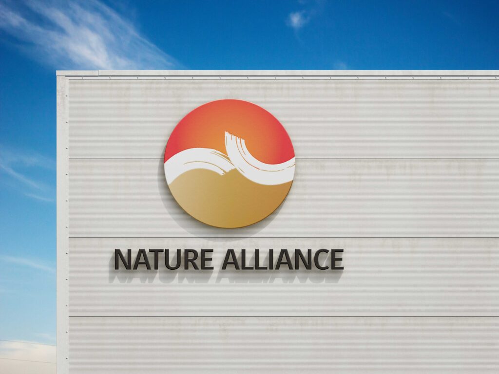
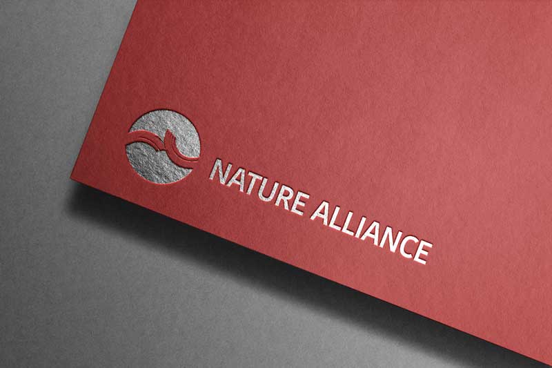
The identity was inspired by the concept of balance found in nature. At the heart of the logo is a circular form that brings together several symbolic elements into a single cohesive mark.
The red gradient represents the sun and fire, expressing energy, ambition, and forward momentum. The gold gradient represents the earth, symbolising stability, value, and strong foundations. The flowing central form represents air and water, conveying movement, adaptability, and connection.
Together, these elements reflect the four fundamental forces of nature: Earth, Water, Air, and Fire. This philosophy became the foundation of the visual identity, representing a balanced ecosystem where growth and progress can thrive.
Building a Meaningful Identity
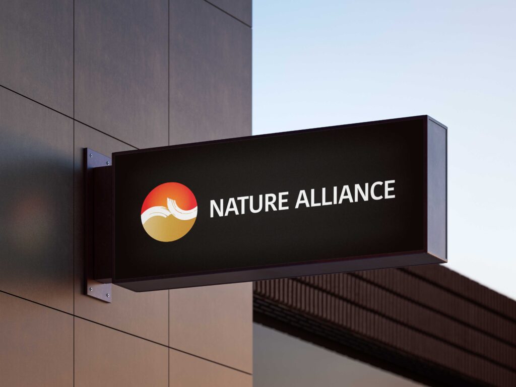
Beyond its symbolism, the logo was designed to be versatile and recognisable across a wide range of applications. The circular structure creates a strong and memorable silhouette, while the flowing internal forms introduce a sense of movement and continuity.
The identity is supported by a carefully developed colour system, typography standards, iconography, and stationery applications, ensuring consistency across both digital and print environments.