Creating a Symbol of Growth, Balance, and Unity
Nature Alliance is a diversified investment group with interests spanning agribusiness, healthcare, finance, hospitality, property development, and international partnerships. The challenge was to create a visual identity that could represent a wide range of industries while maintaining a unified and memorable brand presence.
Rather than designing a logo that focused on a single sector, the objective was to develop a symbol that reflected the group’s broader vision of sustainable growth, connectivity, and long term value creation.
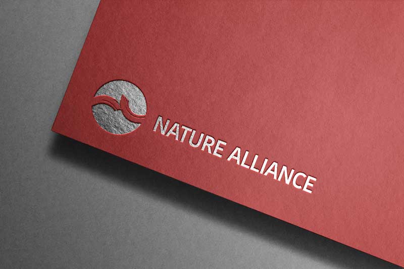
Design Approach
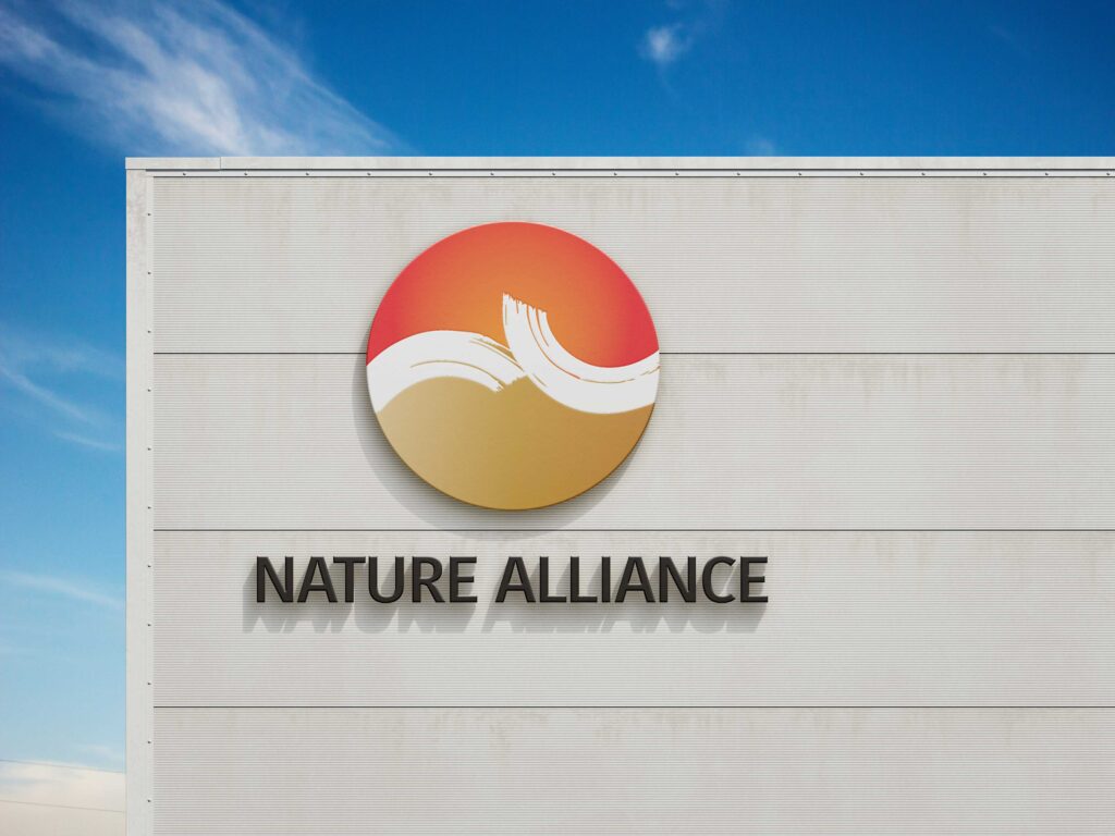
The identity was inspired by the concept of balance found in nature. At the heart of the logo is a circular form that brings together several symbolic elements into a single cohesive mark.
The red gradient represents the sun and fire, expressing energy, ambition, and forward momentum. The gold gradient represents the earth, symbolising stability, value, and strong foundations. The flowing central form represents air and water, conveying movement, adaptability, and connection.
Together, these elements reflect the four fundamental forces of nature: Earth, Water, Air, and Fire. This philosophy became the foundation of the visual identity, representing a balanced ecosystem where growth and progress can thrive.
Building a Meaningful Identity
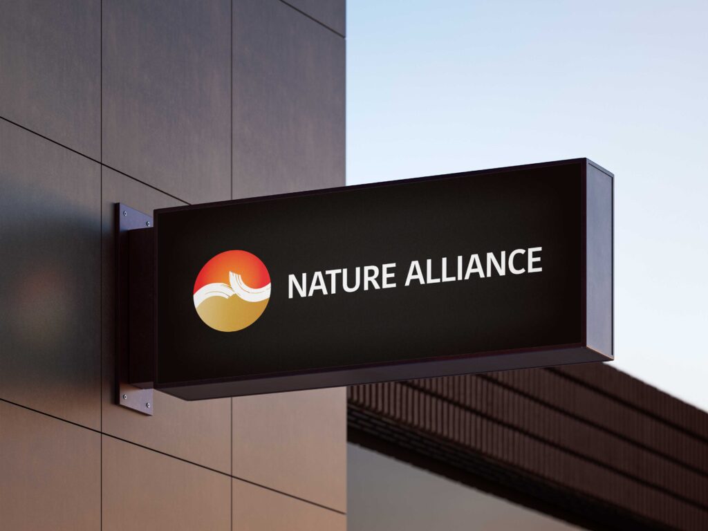
Beyond its symbolism, the logo was designed to be versatile and recognisable across a wide range of applications. The circular structure creates a strong and memorable silhouette, while the flowing internal forms introduce a sense of movement and continuity.
The identity is supported by a carefully developed colour system, typography standards, iconography, and stationery applications, ensuring consistency across both digital and print environments.
The Result
The final identity captures the essence of Nature Alliance as a modern and forward-looking organisation. It communicates strength without appearing rigid, and growth without sacrificing stability.
Most importantly, it provides a flexible brand system capable of supporting a diverse portfolio of businesses while maintaining a unified corporate presence.
A successful brand identity is more than a logo. It is a visual language that communicates purpose, values, and vision. For Nature Alliance, the result is a distinctive identity built upon the principles of balance, connection, and sustainable growth.
Looking to Build a Stronger Brand?
A well-designed brand identity does more than create recognition. It communicates your values, strengthens credibility, and creates consistency across every customer touchpoint.
If you’re planning a new brand, refreshing an existing identity, or developing a complete brand system, let’s discuss how we can bring your vision to life.